Eagle Care Health Solutions Website
Page Creation, User Interviews, Usability Testing, & Changes
Note: This page is in progress. I am in the process of obtaining more pictures and permissions to share them, as the healthcare industry can have liability issues.
Introduction
Context:
Eagle Care Health Solutions (ECHS) is an emerging American healthcare company that wants to become more competitive in the health insurance sector through their low prices and variety of benefits that create value for their customers.

ECHS has recruited Shankx Web Development to help them with website management/improvement and marketing.
My duties at Shankx are both in UX and marketing, so the lines can blur sometimes.

Known Pain Points:
Their website existed, but did not have much of the vital information needed to help users make informed choices when looking for health benefits.
Task:
Take information given about 6 health solutions and put it on the website in a coherent way for the users.

My Role:
• UX Research
• Copywriting
• Webpage Design
• Implementation (uploaded web design using Divi website builder on Wordpress)

Team Members:
• Supervisor (Marketing Expertise)
⇨ Provided input and approval after I presented my findings
⇨ Managed stakeholder relations
• Web Developer
⇨ Fixed small issues using coding knowledge when they’d arise throughout the process
⇨ Helped find tools and solutions to create certain functionality within the site that wasn’t built in

Process
Information Architecture
• Started with one solution at a time
For Each Page:
• Started by sectioning off the types of vital information a user would need/expect while at the same time taking SEO into consideration for the marketing portion of my job.
The sections included:
⇨ Introduction
⇨ Benefits
⇨ Prices
⇨ An SEO-optimized blog-type portion using Frase tool
⇨ Terms and Conditions
⇨ Footer with contact info
• Pages were built first with some secondary research to get something out there quickly, rather than waiting and having nothing. This is for a balanced approach that takes into account both marketing and UX needs.

User Interviews & Usability Testing
• Combined User Interview (short) and Usability Testing into one session for each of 5 users
⇨ This saved on time, resources, and simplified logistics in terms of scheduling users volunteering for free
• Users are clients utilizing ECHS’ services in some way, or having had experience within the U.S. insurance space
⇨ 2 Customers (with focus on employers who need insurance for their employees)
⇨ 3 Agents selling ECHS solutions to customers
⇨ Instead of getting 5 of each type of user, we simplified this as above to save on time and resources, but also because agents serve customers, then we are ultimately working towards getting the customers’ needs met first while ensuring agents can help their customers.
⇨ We also didn’t want to rely solely on the assumptions of the agents for what customers wanted, so we included the customers to get their needs straight from the source.
⇨ To note, marketing goals shifted more towards focusing on helping agents at this point (as stated by stakeholders), while UX goals didn’t lose sight of the customer.

• Gathered information about their usual goals when finding insurance (different questions for customers & agents to get the full picture of each experience)
⇨ Performed User Interviews first so we can start broadly and ensure we aren’t making incorrect assumptions about their goals before starting the Usability Testing.
• For Usability Testing, the main questions were:
⇨ Can they get information about different plans?
⇨ Can they sign up for their plan of interest?
⇨ What do they think “Agent” button does (and go through others too for thoroughness)?
Synthesis
• I looked for common themes between the 5 user sessions to identify the biggest problems.
• Came up with 7 key insights to focus on in next iteration.
• Prioritized insights based on what’s low effort & high impact first
• Sent list to supervisor for approval
Insights:
• “ACA Plans” removed. People were clicking on it because the word “Plans” jumped out at them and they thought they would see a list of all the ECHS plans available but they found out it was some ACA page and they were confused. I wanted to changed “Solutions” to “Plans” but then that might not be legal so we left it.
• Names of each solution in the top menu were changed to be more descriptive of the plan and what they’d actually get. (People were especially confused by “Eagle’s Vision” thinking it was for vision, etc.)
• Privacy statement was added to forms (people felt weary about giving their information to us and worried about what we would do with it and whether we’d sell it or use it in nefarious ways)
• “Brokers” changed to “For Brokers” bc people thought they’d be seeing our actual ECHS agents which would be on our About page.
• “Our Partners” removed as a primary item from the top menu because it added more noise and clutter to that space. It is also not a primary need for users to know our partners, of which there is only one. This is now located under the “About” section.
^ I did one UX Interview after these changes were implemented and the user seemed pretty happy with the arrangement of the site and didn’t notice any issues (except maybe the stuff in the next paragraph below)
• Something else that came up is that users would typically click on the parent of a drop-down menu expecting something to happen (e.g. clicking Individuals or Groups didn’t lead to anything) and we want to create summary pages for these options describing each available plan in bullet points. This has not yet been done due to the wait, finalizing the changes to those plans.
• DID talk about the painful sign up process but Picketts already know. You can’t sign up for a plan unless you go through a convoluted series of steps and even then, it did not work very well…
Implementation
• Once supervisor approved first round of changes, I implemented them into the Divi website builder
• I consulted with our web developer for help with bugs and adding certain features
• Round 2 testing was to begin shortly once more participants were recruited by the stakeholder (managed by supervisor)
Metrics to Measure Success
• Time spent on page (longer means people are actually paying attention to the content)
• Bounce rate (those who stay on the page for less than 3s are considered to have “bounced”)
• Traffic volume (this measures SEO success for marketing purposes)
• Since this project is ongoing, and the pages are newly built, we start with 0 for each, and measure once appropriate changes have been made.
Reflections
I learned a lot from this project, and the why’s of having that approval from someone more in the know of the industry. I am not American and as such, don’t have as in-depth knowledge of the American health system. It was good to know before implementation that certain words can have big legal ramifications. Getting that second opinion from someone more knowledgeable in the field is an important step, and efforts should always be made to consult with others more in the know.
Given how many users expressed concerns about privacy, I will take this as a note moving forward to be more aware of where there may be privacy concerns, and keep an active eye out. This is especially important under healthcare applications where confidentiality is key in sharing sensitive information.
More time spent on page doesn’t necessarily equal engagement. Users could be lost or distracted. A more accurate metric of engagement could be obtained through heat map or activity tracking tools, but given we are a small company with limited resources, this was not possible.
To be continued…
That's all I have for now, but feel free to connect with me to talk about my research, designs, or anything, really!
Selected Works
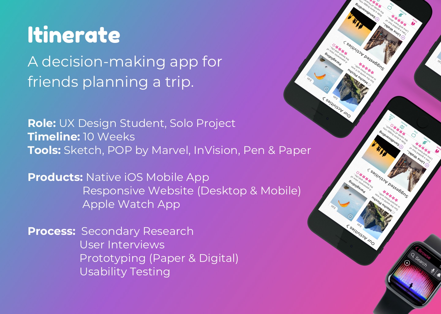
Itinerate (2020)Trip Planning (iOS, Apple Watch)

Eagle Care Health Solutions (2022)Website Creation / User Interviews / Usability Testing (Desktop, Mobile)

Yelp (2020)Heuristic Redesign (iOS)