Yelp Redesign
For this project, my 2 teammates and I noticed a number of issues with the Yelp app and thought we could improve it.
We used the 10 Usability Heuristics from the Nielson group to guide us in identifying and categorizing issues.
The tasks were split up evenly as a group.
We started broadly identifying as many issues as we could and categorized them as one of the 10 heuristics.
Some issues involed more than 1 heuristic but we assigned it to 1 based on relevance as agreed upon by the group.
From there, we worked to brainstorm solutions together to alleviate the issues.
Various ideas were discussed and once agreed upon, the work of designing was evenly split up again.
We used the Yelp Style Guide to maintain visual consistency with the rest of the app and came up with a number of solutions.
We detailed them in a manner to be presented to stakeholders at Yelp, as per below.
For this presentation, I wrote the copy while my teammate, Ben, did the graphics, and Ana helped organize the screenshots and supply images as needed.
The most important thing I learned from this project is how not to talk to stakeholders, and the vocabulary to use in order to not offend them about their product or put them on edge. This is a very important element when working in UX and words like "outdated" should not be used. Instead, wording it in a more progressive forward-looking light would be better, for example, "We can update this." It will be something I keep in mind for all future projects.
I have ammended the above to include this vocabulary. (No I haven't yet)
Hey there, this is the default text for a new paragraph. Feel free to edit this paragraph by clicking on the yellow edit icon. After you are done just click on the yellow checkmark button on the top right. Have Fun!
Selected Works

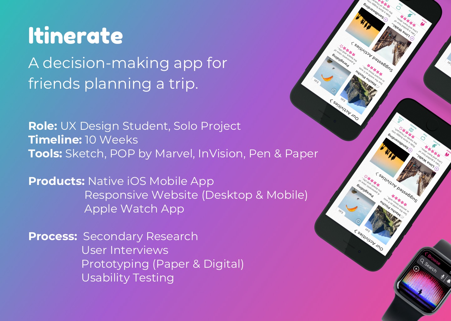
Itinerate (2020)Trip Planning (iOS, Apple Watch)

Eagle Care Health Solutions (2022)Website Creation / User Interviews / Usability Testing (Desktop, Mobile)

Yelp (2020)Heuristic Redesign (iOS)